
")
A 2010 University of Rochester study found that men rated women in red significantly more attractive than the same women photographed in other colors. The researchers ran five separate experiments. Each time, red won.
That study gets quoted in every “most attractive dress color” article ever written. What those articles skip: the research used identical images with digitally altered clothing colors, controlled for everything except hue, and measured one narrow definition of attractiveness. It didn’t test burgundy versus tomato red. It didn’t account for undertone. And it didn’t ask what color performs best at a Tuesday dinner date versus a black-tie event.
Real-world dress color is more nuanced than that. After tracking what gets noticed across years of dressing — and watching friends make the same expensive mistakes — here’s what actually determines whether a dress color reads as attractive or forgettable.
Why Red Dominates Research (and Where the Research Stops Short)
The attraction-to-red effect is real and well-documented. It’s not just Rochester — similar findings emerged from studies in Germany, England, and China. Red triggers associations with passion, confidence, and status across cultures. When you wear it, you borrow all of that symbolic weight instantly.
The problem is that “red” is doing a lot of heavy lifting in that sentence. There are roughly sixty commercially available shades of red. Tomato red, scarlet, cherry, crimson, ruby, vermillion, brick, coral-red, fire engine — they all test differently on skin. Treating them as one category is where the “just wear red” advice falls apart in practice.
What the Research Actually Measured (and What It Missed)
The Rochester study used a single saturated, warm-leaning primary red. That shade photographs beautifully on golden and olive skin tones. On cool-undertoned skin — pink or bluish surface veins, not green — that same red creates a color clash that makes the wearer look tired rather than vibrant. The studies measured attractiveness ratings from observers, not wearers. There’s a meaningful gap between “looks attractive in a photograph” and “feels confident wearing it in a room.”
Confidence — the kind that comes from wearing something that genuinely suits you — is one of the strongest attractiveness signals that exists. A woman slightly uncomfortable in a color she was told is “most attractive” reads completely differently than a woman in a color she owns completely. That confidence variable never showed up in the research.
The Shade Problem Within Red
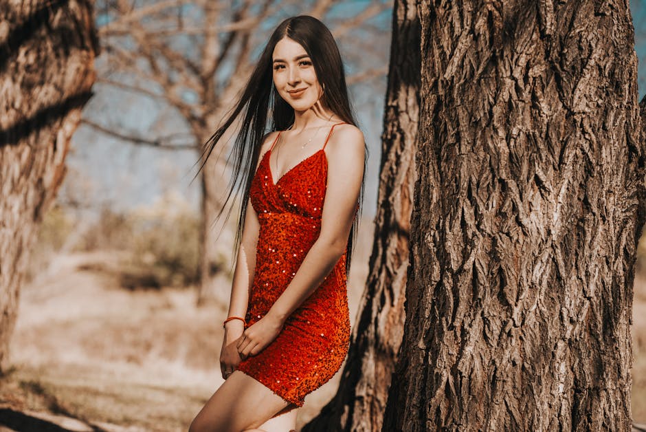
Cool-toned reds (berry, raspberry, ruby) behave completely differently from warm-toned reds (tomato, rust, coral-red). Cool-toned reds flatter cool undertones. Warm reds flatter warm undertones. The Reformation Cynthia dress comes in “Cardinal” — a true, slightly warm red that photographs strikingly — and is one of the more universally flattering reds at a mid-range price point around $218. Put it next to Anthropologie’s “tomato” colorway on someone with very cool pink-toned skin, and you’ll see exactly what shade divergence looks like. Same hue family. Completely different result.
Skin Undertone vs. Dress Color: The Variable Nobody Accounts For
Every conversation about attractive dress colors that skips undertone is incomplete. This table reflects what actually holds up across styling advice, not just what sounds good in theory:
| Undertone | Most Flattering Colors | Colors That Wash You Out | Works Either Way |
|---|---|---|---|
| Warm (yellow/golden) | Warm red, coral, burnt orange, olive green, camel, gold | Icy pastels, cool lilac, silver-toned neutrals | Navy, emerald, ivory |
| Cool (pink/bluish) | Burgundy, cobalt blue, emerald, dusty rose, navy, true white | Warm orange, yellow, rust, warm brown | Black, deep jewel tones, soft mauve |
| Neutral | Almost any jewel tone, classic red, forest green, camel | Very few true problem colors | Most colors; only very muted muddy tones cause issues |
How to Identify Your Undertone in 60 Seconds
Look at the veins on your inner wrist in natural light. Green veins mean warm undertones. Blue or purple veins mean cool undertones. A genuine mix — hard to call either way — usually means neutral. That’s the whole test. No jewelry comparison, no white paper, nothing else required.
The Colors That Work Across Every Undertone
Navy and emerald green appear in the flattering column for nearly every undertone category. Deep cobalt reads cool enough for cool undertones and saturated enough for warm ones. These are genuinely universal options — which is why they show up so consistently in styling advice that holds up across body types, seasons, and decades. If you’re ever unsure, both are safer bets than red.
Burgundy Outperforms Red on Most People
This is my clear position: burgundy is more attractive than red on the majority of wearers. It carries the same psychological weight as red — depth, richness, confidence — while its cooler, darker undertone flatters a wider range of skin tones. The ASOS DESIGN wrap midi dress in wine sells out in that colorway before it sells out in red every season. That’s not a coincidence.
Buy burgundy first. Test red only once you’ve confirmed your undertone leans warm enough to carry it.
Four Colors That Consistently Draw Attention Across Occasions
These four earned their spots not from a single study but from consistent real-world performance — they show up in what stylists reach for, what photographers respond to, and what actually gets remembered after an event.
- Emerald green. Saturated enough to photograph distinctly, rare enough that you won’t match three other women at a party. It flatters cool, neutral, and most warm undertones. Free People’s emerald maxi styles and Revolve’s Lovers + Friends dresses in hunter green consistently top their most-wanted lists. For formal wear, emerald is one of the strongest non-black choices available.
- Cobalt blue. The correct blue — not baby blue, not dusty sky, but a true saturated cobalt — creates the same visual attention as red without the aggressive association. It reads confident rather than aggressive. Cool undertones wear it best, but it works across more skin tones than most people expect because the saturation is doing the heavy lifting.
- Burgundy or deep wine. Already covered above, but worth restating in ranked context. If you’re choosing one dress to own that photographs well and reads attractively in person across multiple occasions, this is the answer for most people. The depth of the color creates contrast without the cultural baggage of red.
- Dusty rose or mauve. This one surprises people. Soft pinks that lean dusty rather than pastel carry warmth without reading as trying too hard. The Reformation “Mauve” colorway appears across multiple styles each season and ages better than blush. It’s the strongest answer for daytime and date occasions where saturated jewel tones feel like overreach.
All four of these share one characteristic: they have clear saturation or genuine depth. Washed-out versions of any of them work against you. Pale cobalt is not cobalt. Blush pink is not dusty rose. The specific shade matters as much as the color family.
Does Occasion Change the Most Attractive Color?
What is the most attractive color for a first date?
Red or burgundy — but only the right shade for your undertone. The psychological research holds most cleanly here because a first date is exactly the context those studies simulated: you want to be noticed and read as desirable. Dusty rose is a softer second choice if red genuinely doesn’t suit your coloring. Avoid black specifically on first dates. It reads as safe rather than intentional, and there’s very little psychological signal in it beyond “I didn’t want to make a decision.”
What works best for a formal event or gala?
Emerald green and deep navy consistently outperform red at formal occasions. At galas and black-tie events, nearly everyone defaults to black or red — wearing emerald makes you the person people remember when everyone else blurs together. Deep navy reads sophisticated in a way pure black doesn’t, because it carries color depth rather than being an absence of color. The Retrofête “Gabrielle” sequin dress in emerald has appeared at enough high-profile events to confirm the principle at work: at formal occasions, distinctiveness is attractiveness.
For daytime occasions, does color psychology shift?
Yes, meaningfully. Saturated jewel tones can read as overdressed in daylight. Dusty rose, warm terracotta, and soft coral earn their keep at brunches, garden parties, and casual dinners. Terracotta specifically photographs well in warm natural light — it’s become reliable for daytime event dressing. Shein and H&M consistently sell out terracotta styles first each spring, which is one honest data point about what people actually reach for when dressing for daytime visibility.
Colors That Feel Safe but Actually Make You Disappear
Some colors are popular for reasons that have nothing to do with being attractive — they’re easy to style, they work with everything, they feel low-risk. None of those qualities are the same as attractive.
The Beige Trap
Greige, taupe, light camel, and warm sand are everywhere because they’re easy neutrals. They also wash out most skin tones in photos, create minimal contrast, and generate the least visual attention of any dress color category. I have seen expensive dresses in these shades look cheap in photographs purely because there’s nothing for the eye to latch onto — no contrast, no depth, no signal. Warm neutrals only work when your skin tone is cool enough to provide the contrast the color itself refuses to create.
The narrow exception: rich, darker camel can work on very pale cool-toned skin precisely because of that contrast. But that’s a specific situation. Most people wearing beige dresses are doing so out of habit, not because the color is serving them.
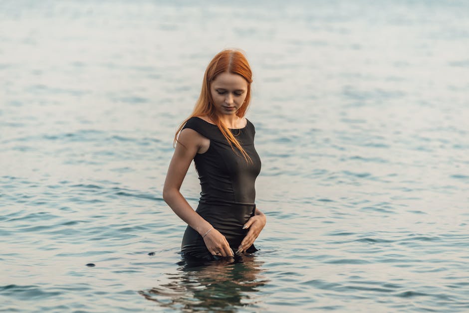
When Black Actually Works Against You
Black doesn’t attract attention — it deflects it. That’s useful in certain contexts: not wanting to stand out, looking composed rather than visible, formal occasions where the silhouette carries the work. But if you’re choosing a dress specifically because you want to be seen as attractive, black is doing the opposite of what you think. It creates no visual information about your coloring, produces harsh contrast against most skin tones, and reads as a default rather than a deliberate choice.
A black cocktail dress is, very often, a missed opportunity. The same budget spent on a well-chosen jewel tone does more work for you in almost every casual and semi-formal context.
The Honest Verdict, Context Included
Back to where this started: the University of Rochester research is real, and red does work. But “red works” and “red is the most attractive color for you” are two different statements. Most people act on the first when they need to be thinking about the second.
Here’s the compressed answer by situation:
- First date, warm undertone: warm red or coral-red — Reformation Cardinal, or Revolve NBD label wrap dresses in red
- First date, cool undertone: burgundy or cobalt blue — ASOS wine midi, any deep ruby with blue-red undertones
- Formal event, any undertone: emerald green or deep navy — you’ll be remembered when everyone else wears black
- Daytime or casual, want to be noticed: dusty rose, terracotta, or mauve
- One dress to own that covers most situations: burgundy, medium depth, matched to your cool or warm shade
The Rochester study gave us a useful starting point. Undertone, occasion, and shade deliver the actual answer. The women who consistently look most striking in color aren’t choosing whatever headline said is “most attractive” — they’re finding the version of that color that makes their specific coloring pop. That gap between the research and the execution is where almost every dress color mistake happens.